Deprecated: mb_convert_encoding(): Handling HTML entities via mbstring is deprecated; use htmlspecialchars, htmlentities, or mb_encode_numericentity/mb_decode_numericentity instead in /home4/lugsandl/public_html/wp-content/themes/acabado/functions.php on line 1987
Printed vs applied indices, which one would you choose if given the choice? The answer becomes more complicated the more you think about it. Is it for a dress watch, or a military-inspired tool watch? Will it aid in legibility, or make it worse? Applied indices are seen as more premium, but they’re not necessarily the best choice.
Team Applied Indices


I actually love the look of nicely done applied indices. Especially if they’re deep and stand tall on the dial. This gives the dial a really cool three dimensional look. It also allows the indices to play with light and reflections at all different kinds of angles.
Place them on top of an elaborately decorated dial, like the sunburst, guilloche dial of my Seiko SARB065 “Cocktail Time” – and I think you have a winning combination. They also look great on complex and detailed dials, such as the IWC Mark XVI Spitfire.
To be honest, printed indices would have looked good here, too, and made the watch more “toolish”. Instead, the deeply applied Arabic numerals add dimension to the dial, enough to make it a very versatile piece that I think could double as a dress watch in a pinch.
On more classically-styled dials, without all the fancy guilloche and silver-plating, applied indices can really make the watch. The SARB035’s dial is really nice, but I think that printed indices would have made the watch boring and flat. With the nicely finished applied indices (and applied SEIKO logo), it adds visual interest and compliments the dial nicely. It adds that extra “something” that makes the SARB035 a classic, in my opinion.
Team Printed Indices


As much as I’m a fan of applied indices and markers, sometimes it’s better to keep it simple. I think my Hamilton Khaki Field would look ridiculous with applied indices. The simple printing speaks to the basic, military-inspired design of the watch.
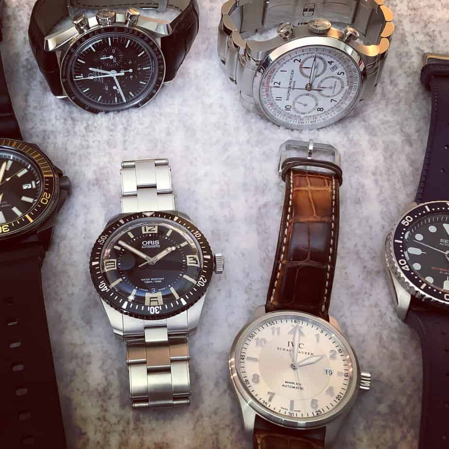
Same goes for another classic tool watch – the Omega Speedmaster Professional. It’s an iconic design, and there’s a reason that the dial hasn’t been “upgraded” with applied indices (although I wouldn’t mind an unobtrusively applied Omega logo like the new sapphire models have).
Applied indices also leave room for error. Misalignment issues, even if barely noticeable, are probably way more common with applied indices than they are with simple printed dials. My Certina DS Powermatic 80 had slightly misaligned indices, and it always drove me crazy.
Another example where I favor printed markers is on the Oris Sixty-Five. The printed indices are lumed, and it looks really great in low light situations. I like this dial configuration much more than the other Oris Sixty-Five models with applied, but simpler indices and markers. This is a personal opinion, but I’m sticking to it.
The Third Option: A Happy Medium Between Printed And Applied Indices
There’s also another option, which is stamped indices. I owned a Baume & Mercier Classima with stamped indices, which was actually very nice. you get the three-dimensional look of applied indices, without the inherent possibility of misalignment issues. While some might consider stamped dials a cost-cutting move, or even cheap, I think it’s kind of the best of both worlds.


The Breitling Superocean 42 is a dive watch that I admire quite a bit, and I think the stamped markers look awesome. I love the white dial version of this watch. The stamped, raised blue markers really pop against the stark white dial. There’s nothing cheap looking about it.
Conclusion
When it comes to applied markers vs printed ones, I think it comes down to the style of watch. Neither one is particularly “better” or more premium. I think there’s a perception that applied indices and markers are more luxurious, but many cheaper watches have applied indices, and in many cases, printed indices just look better from a design perspective.
Printed markers don’t usually suffer from misalignment issues like applied indices can, but even that’s not a rule set in stone. If you’ve ever owned a Seiko diver, you know what I’m talking about. The iconic Seiko SKX dive watches almost always have misalignment issues, despite a printed dial.
If I bought an SKX that didn’t have misalignment issues, I might even think that it was a fake. That’s how common an issue it is. My Seiko Samurai also has minor misalignment issues, despite a higher price tag and applied indices, so at the end of the day, it’s probably just a Seiko thing.
Luckily I’m fortunate to be able to own multiple watches as part of a collection, so I can enjoy a mixture of watches with both applied and printed indices. I enjoy wearing them all, applied or printed.